Overview
SnowOnly.com is a specialized platform focused on the buying and selling of ski properties. It enables users to search for ski chalets and provides comprehensive information to help them make informed decisions about purchasing their ideal ski property.
My role was to build this website from the ground up. The client requested a design that embraces a relaxing, illustrative style, in contrast to a traditional corporate look.
Project Type
Intellectual Rights
Time
Role
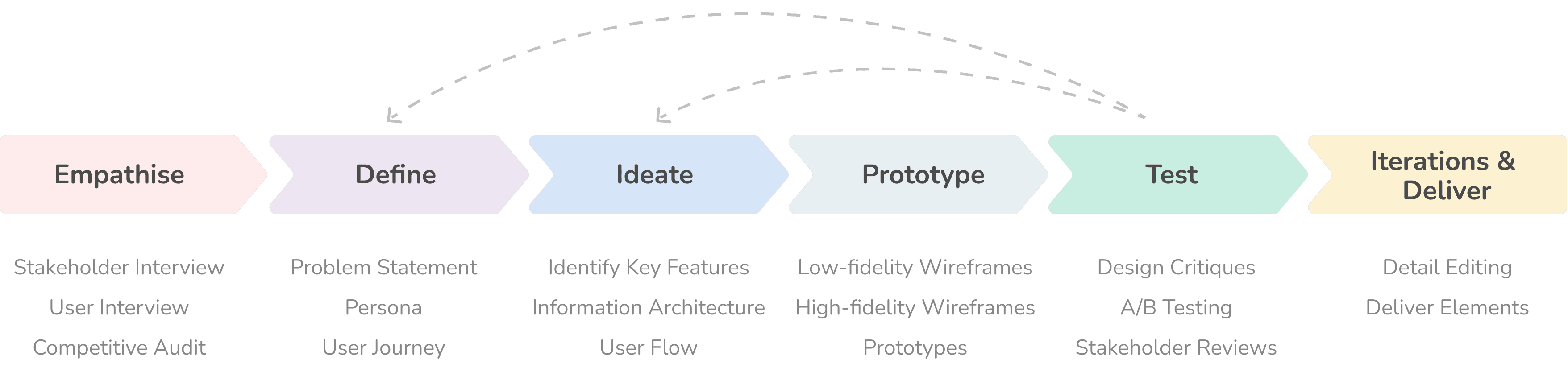


Empathise
Our first step was to understand the business goals and user needs. I interviewed the primary stakeholder, an experienced investor and landlord. He identified a market gap: while many sites advertise real estate, few focus on ski chalets. He provided a list of competitors to help me understand the business model. Essential features for a site like this include listings to sell or rent out for landlords, location-based property searches, detailed property info, comparison tools, and an inquiry form.


We interviewed three groups: travelers who enjoy outdoor activities, families with vacation homes, and those who frequently rent vacation properties. Our key questions included:
Can you describe your most recent vacation?
How did you plan for it?
What influenced your choice of accommodation?
What factors are important when deciding where to stay or what to buy?
From these interviews, we identified three main customer segments:
Property Owners: Those looking to sell or rent out vacation properties.
Vacation Home Buyers: Families interested in purchasing a ski chalet.
Short-Term Renters: Friends renting a house in a ski resort.
Based on the insights gathered, we developed personas for three user types: buyers, tenants, and property owner/agencies/developers.


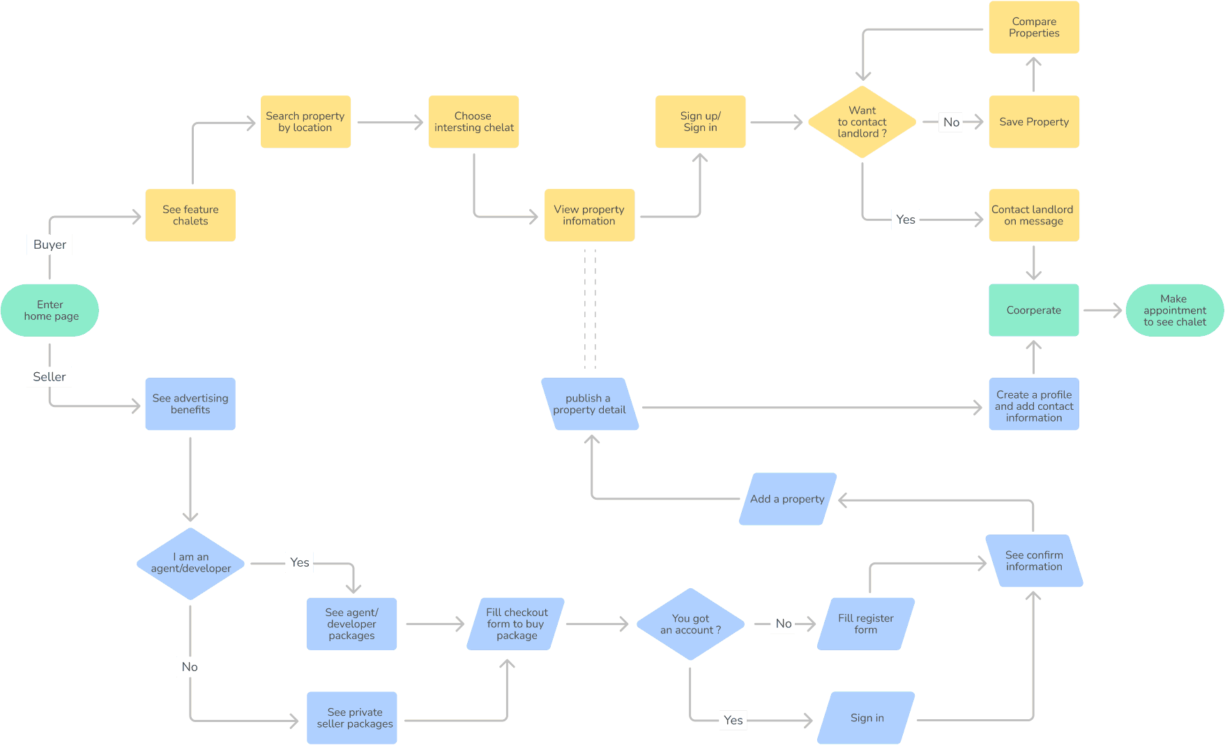
As you can see from the flowchart, we were able to identify additional features for our site. Below are the essential features for sellers: viewing and purchasing packages, account creation, listing and collecting properties, request messenger, and profile creation.
For buyers and tenants, the essential features include: property search, inquiry messenger, comparison tool, and account creation.
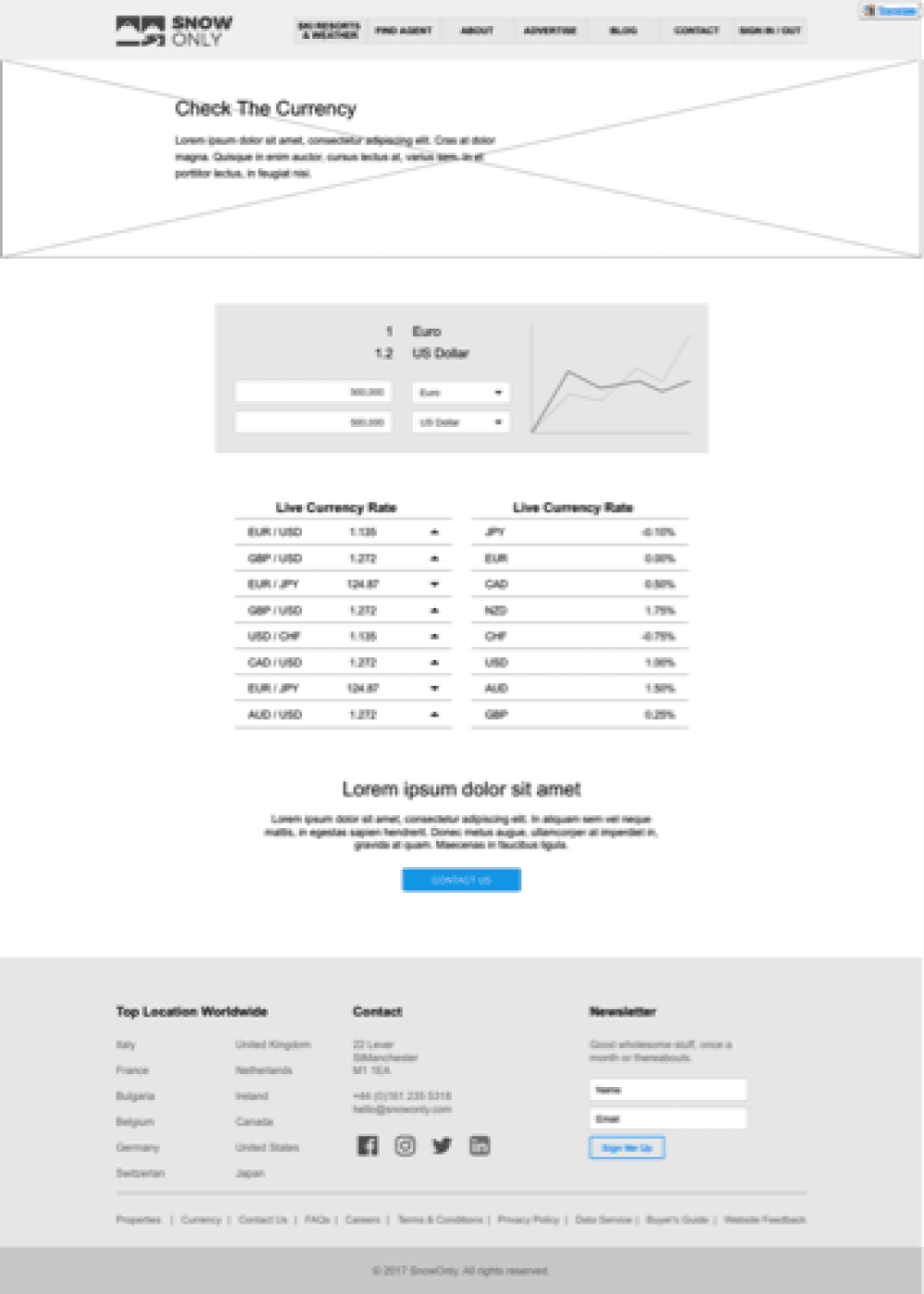
All of the above are must-have features. Additionally, we have outlined some nice-to-have features: finding an agent, seller and buyer guides, currency calculation, blog, lenders and financial institutions, and website feedback.
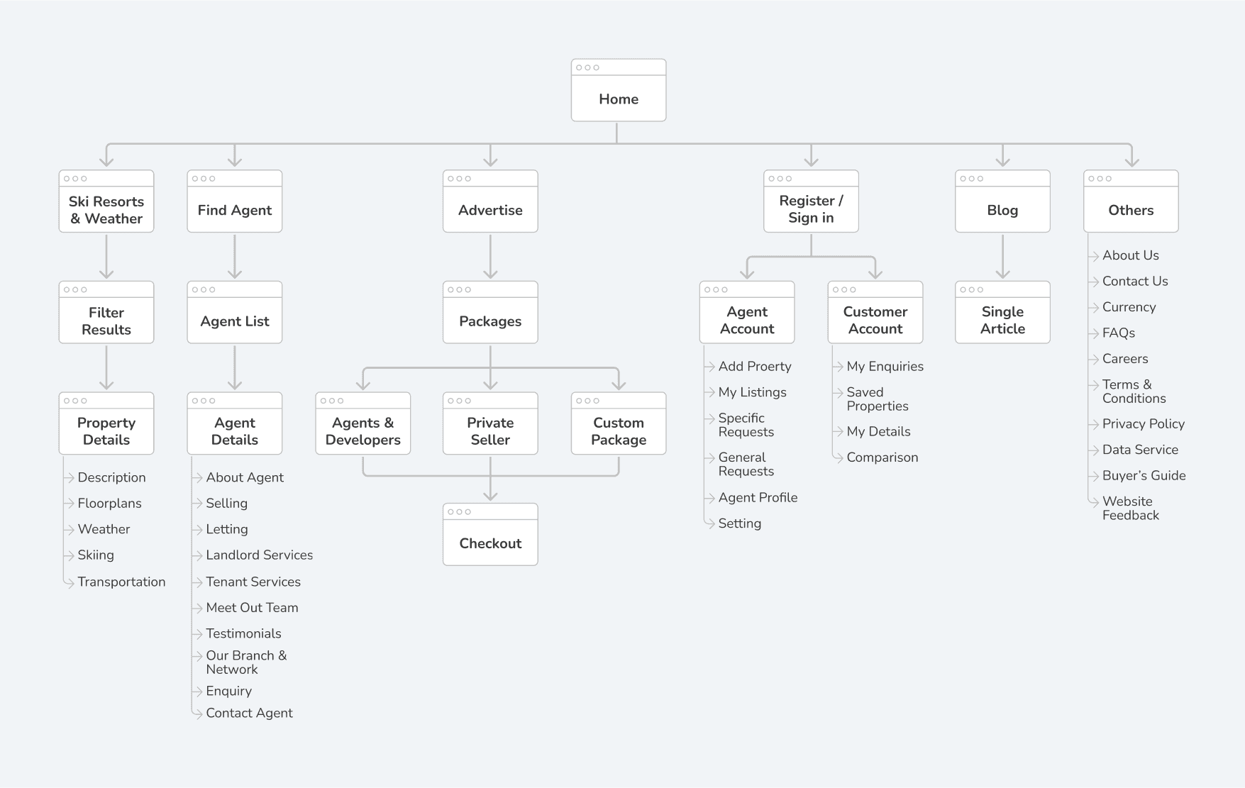
Since we had a clear understanding of the features we needed to build, we broke them down into smaller tasks and created the site map, as shown below.
Then I started sketching several versions of the lo-fi wireframe on paper and used them as rapid prototypes for usability testing to gather feedback from users. I digitalized the wireframe using UXPin, after which we conducted a design critique and presented it to the stakeholders. Following the review with the stakeholders, we made minor design adjustments to better align with the business objectives.

The Design
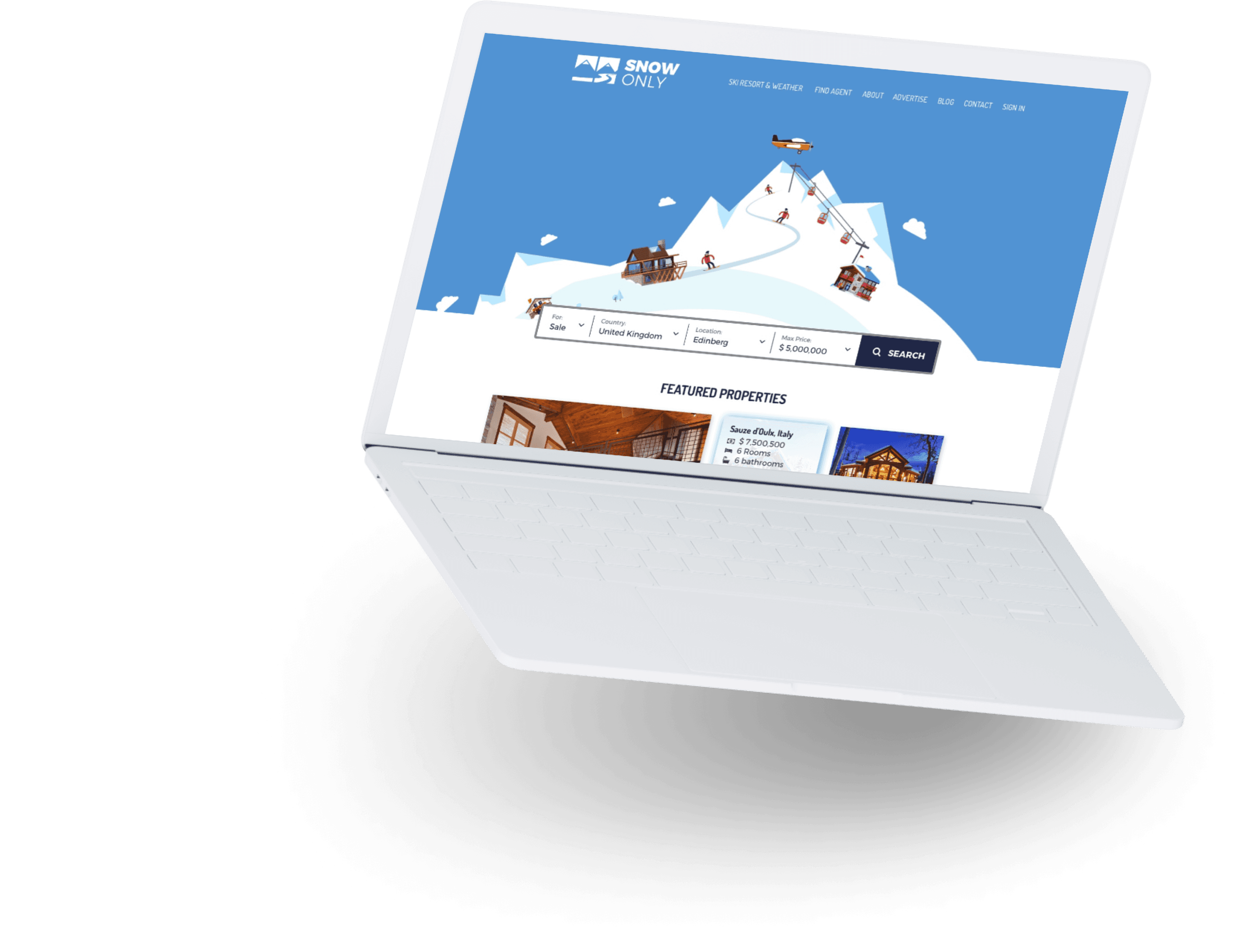
The website owner requested the use of illustrations on his website. He doesn’t like the traditional corporate look. The design should convey a creative and fun vibe to encourage users to engage in winter sports travel.
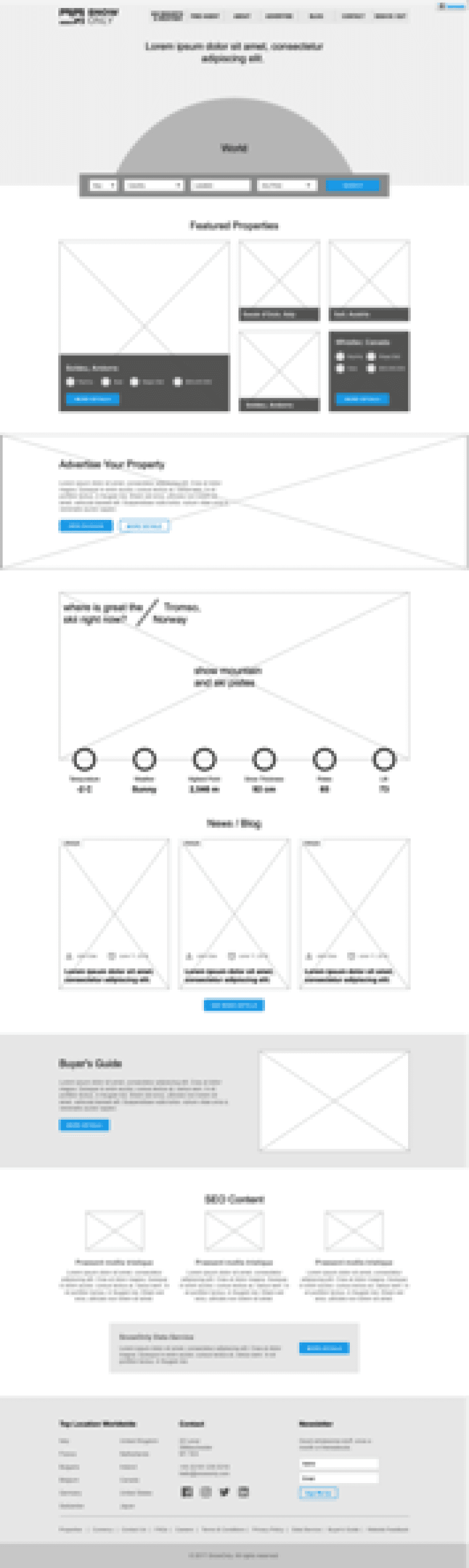
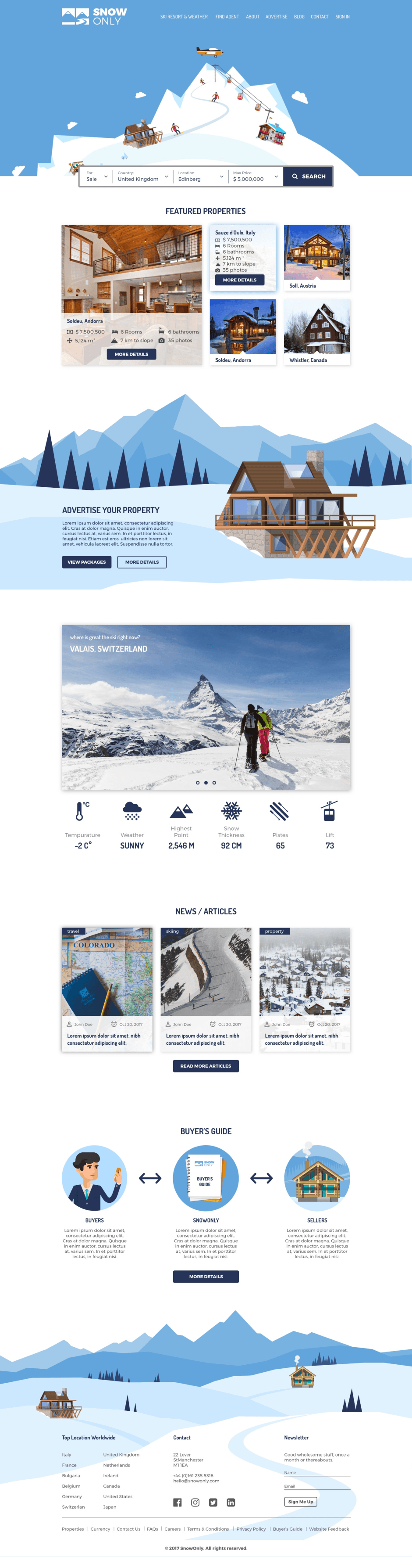
On the homepage, we have a property search bar, featured properties, recommended ski slopes and weather, articles, and buyer guides.
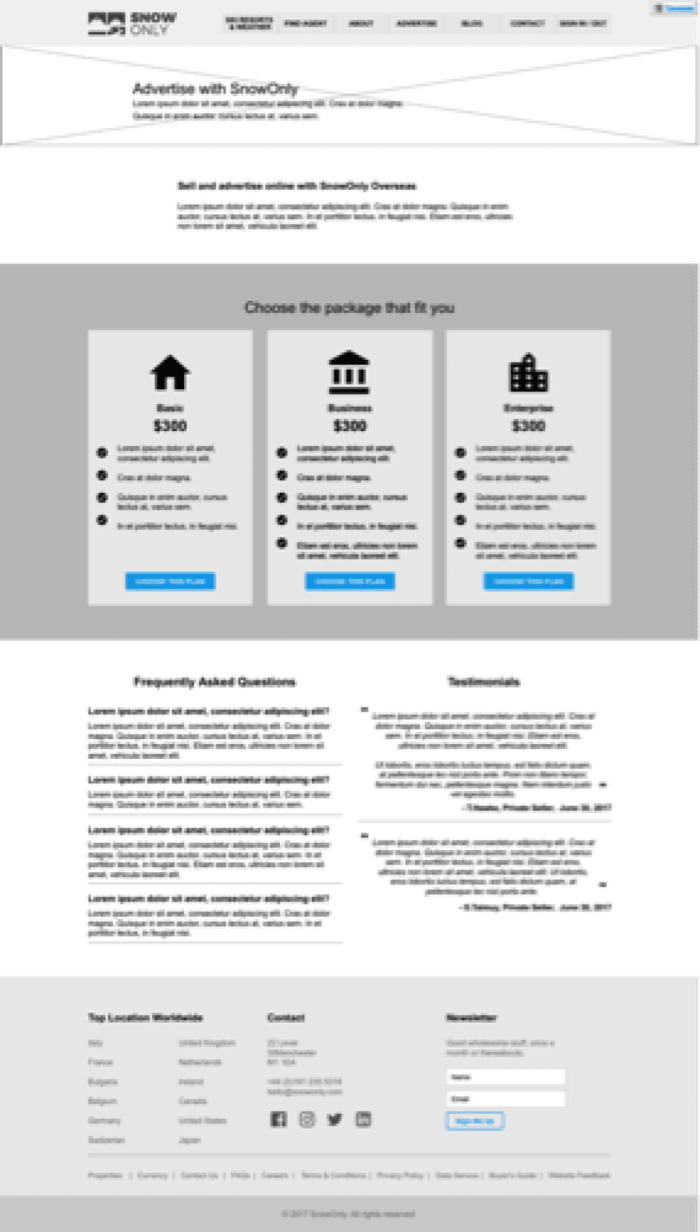
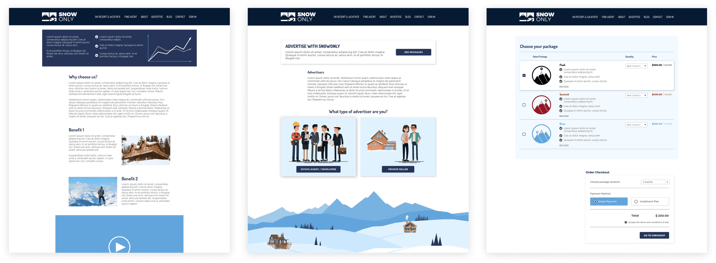
Purchasing the Package
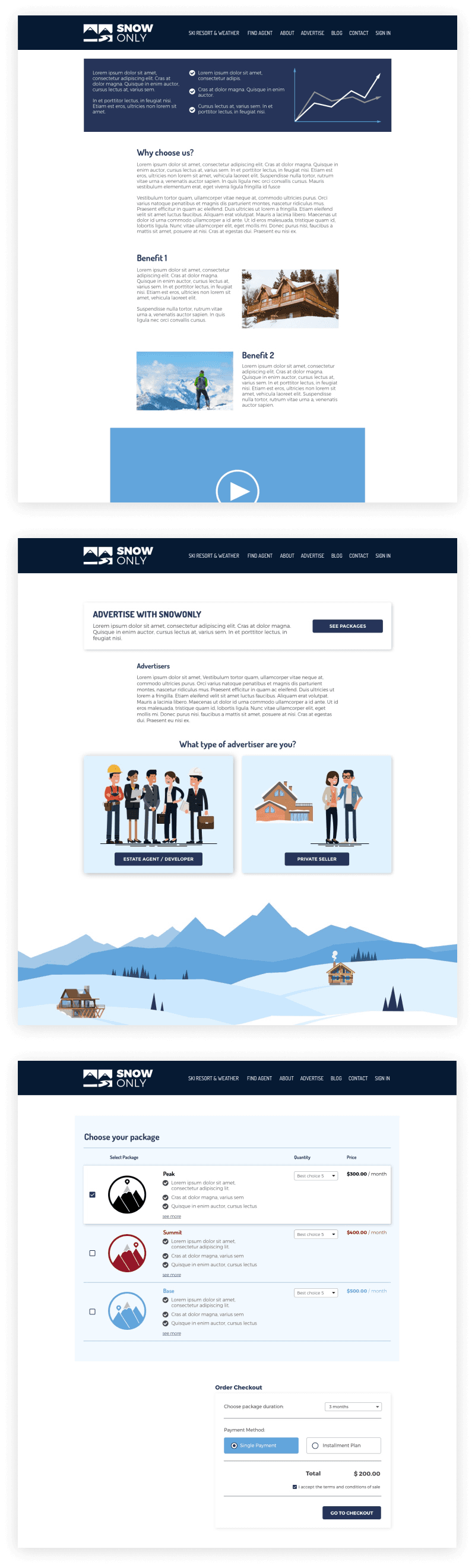
Developers and agents can choose the package that fits their purpose. The higher package plan offers more properties to advertise, increasing the chances of the property being seen.
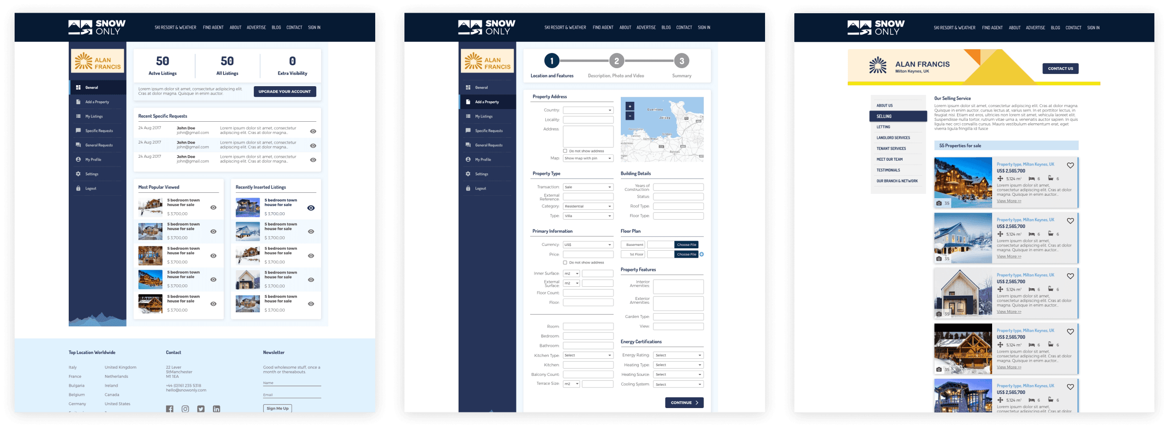
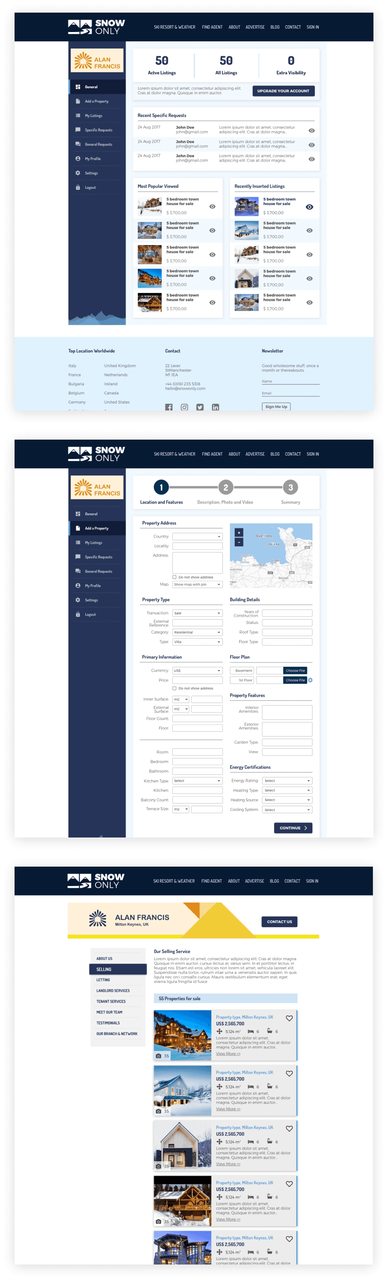
Agent/Developer Account
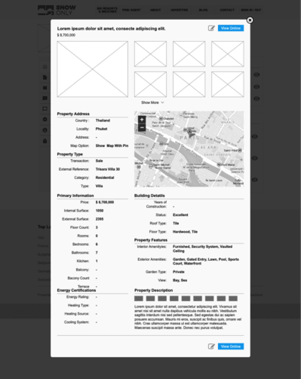
After registering and choosing a package plan, the agent can create their profile and post property details. The letting form is designed for quick completion, as I have grouped related information. Once published, the audience will see the same information in an organized layout, making it easy to read.
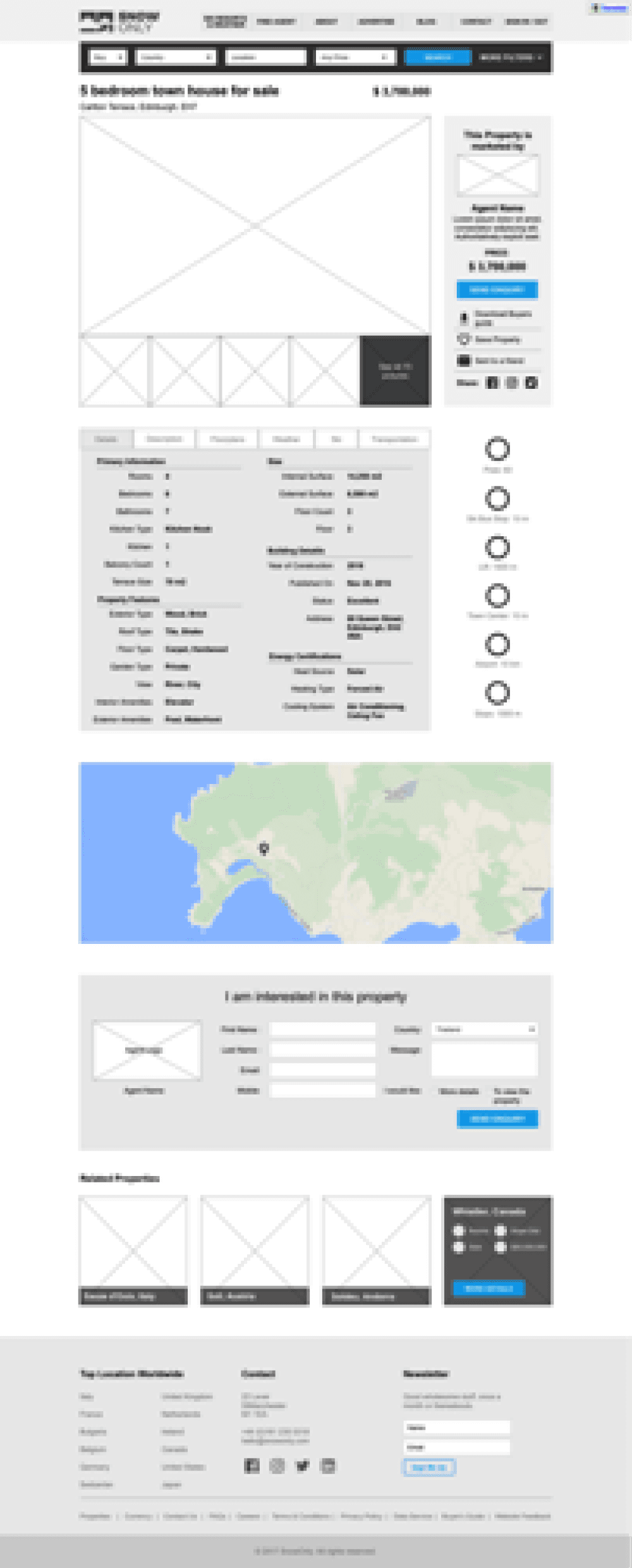
Search & Results
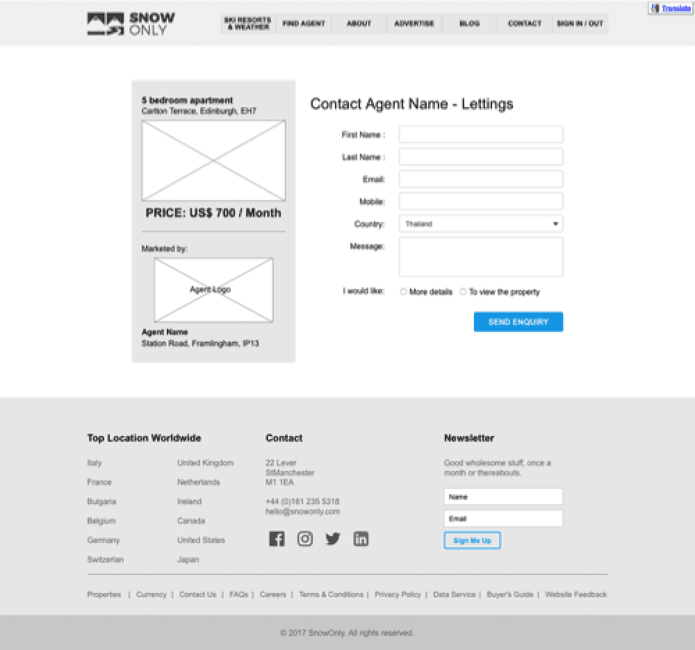
Visitors don't have to sign up to use our website. They can search for properties to buy or rent, and we provide filters to help them find chalets that match their criteria. Once they find the right accommodation, they can click to view the property details. However, if they want to save a property or contact the agent, they are required to register first. This way, when they sign in again, they will still see their saved properties and any inquiries they have sent to the agent or developer.
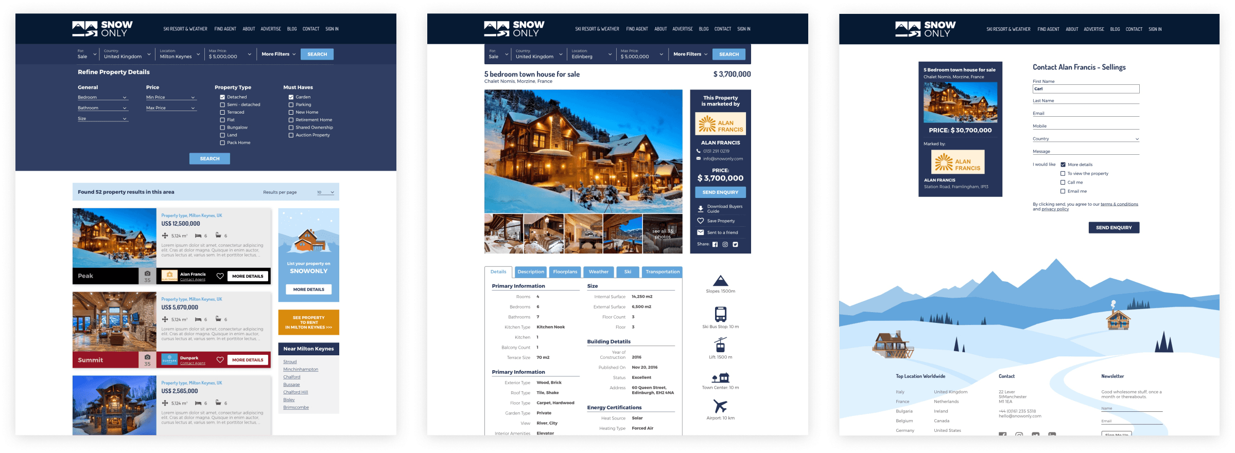
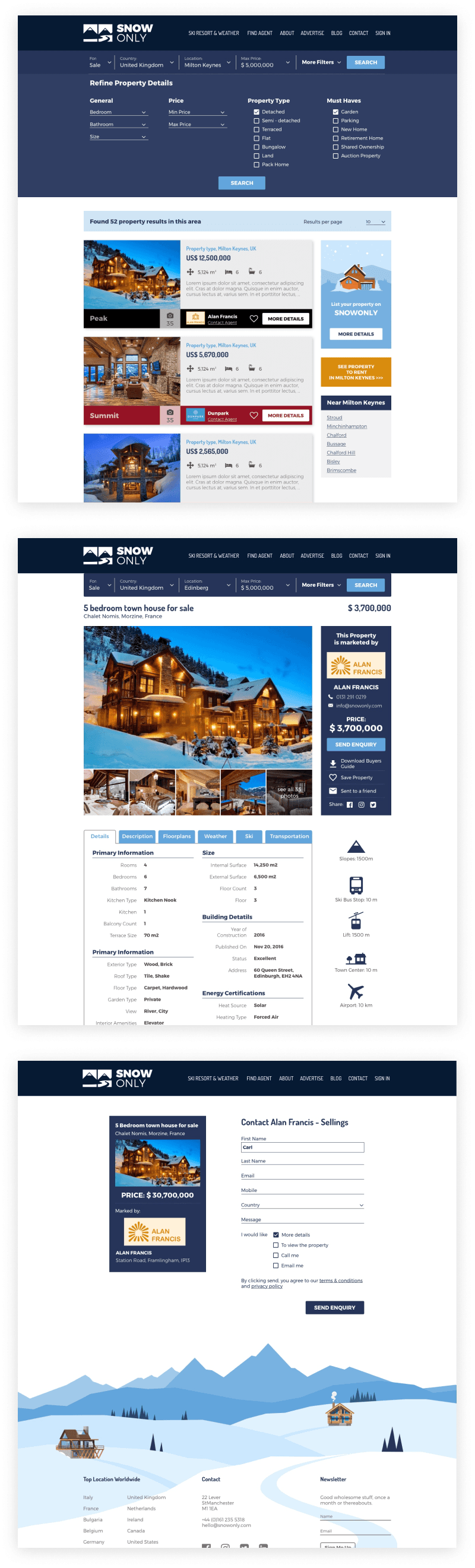
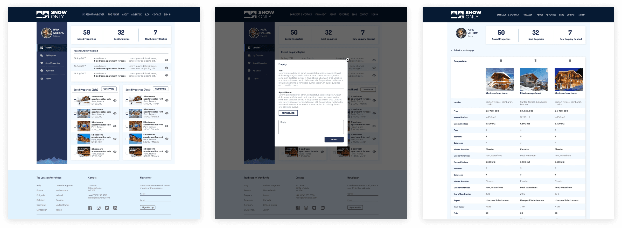
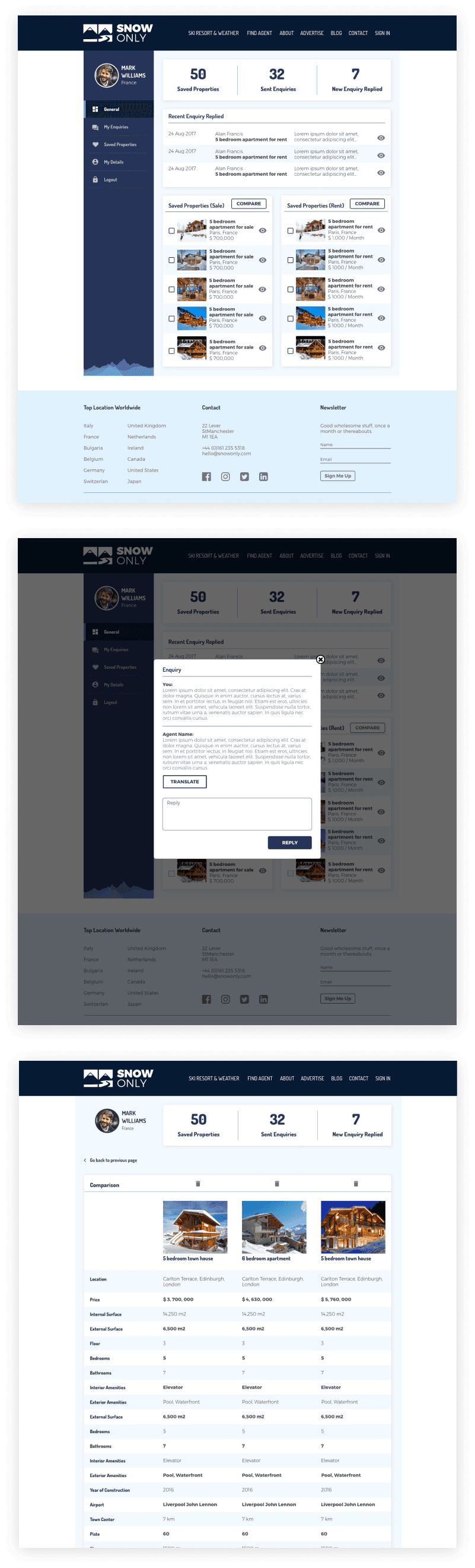
Customer Account
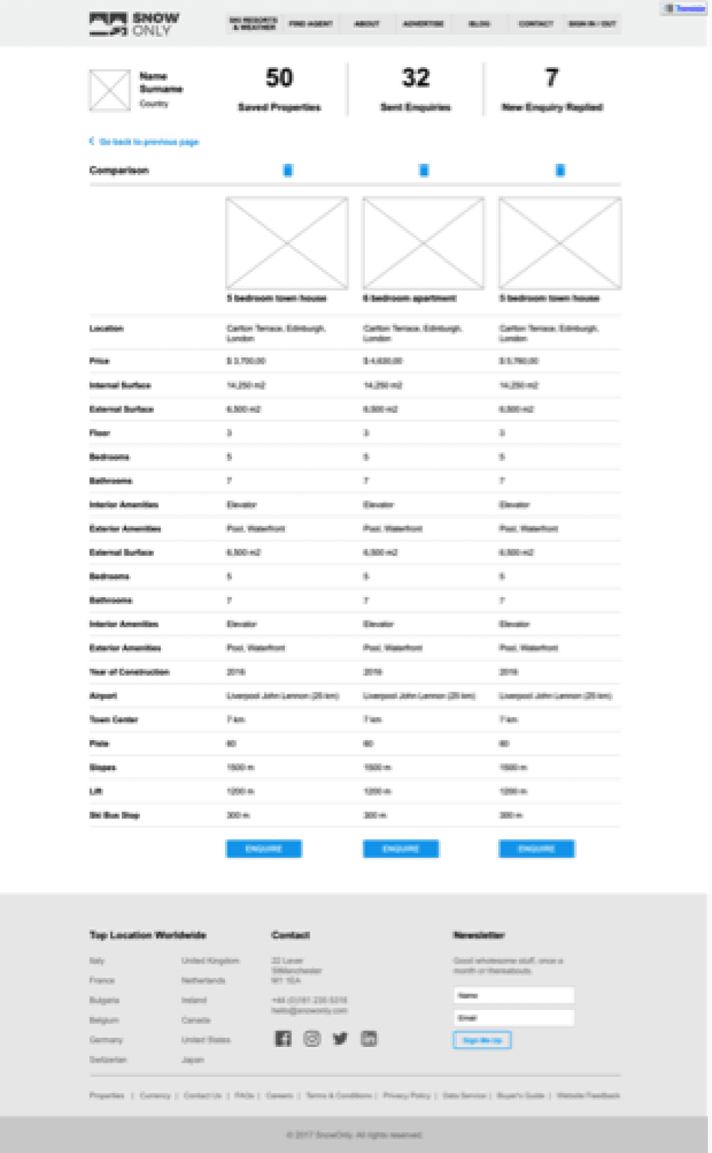
When visitors become members, they have their own accounts where they can collect all their favorite places and the inquiries they have sent to agents. Additionally, they can compare their favorite properties to find the most suitable chalets for them.
The core features rely on the results of user interviews. We didn't wait to find the perfect target group to interview; instead, we pushed our process forward. It's never too late to test ideas and gather feedback for improvement. It’s not easy to find people who have gone skiing and are interested in buying a ski chalet, so we spoke with people who enjoy outdoor activities and own properties instead. Regardless, they provided valuable insights into the type of information they want to see on the website, allowing us to deliver solutions that addressed their pain points.
We began by studying the business goals and user pain points. Then, we brainstormed solutions and turned them into features. It’s not about what we want to offer our users but about giving them what they truly need. While we empathize with users, we also keep the business objectives in mind. We studied the business proposition to understand where our client can make a profit. Our work is complete only when business goals align with user needs.
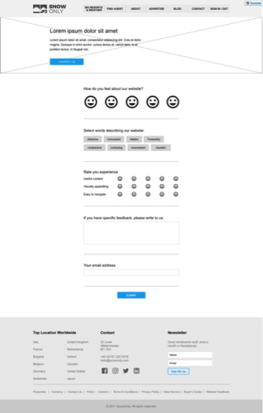
After reviewing this project, I found many areas for improvement. As time passes, user behaviors change. To adapt, I created a user satisfaction survey within the platform to collect quantitative data. We can combine this data with insights from usability testing results to guide us in the iteration process.
Reflection


More case studies