

More case studies
Overview
B2P is a procure-to-payment platform designed to reduce paper usage and manual processes, which often lead to inefficiency and errors. The platform leverages blockchain technology to verify, match, and share purchase orders (PO), goods receipts (GR), and invoices among buyers, suppliers, and banks, ensuring that information is trustworthy, secure, and transparent.
My role was to redesign the platform, enhance the user experience, and deliver both the user interface and a comprehensive style guide.
Web Application
Web Application
Project Type
Digital Ventures Co., Ltd.,
Digital Ventures Co., Ltd.,
Intellectual Rights
August 2018 - Present
August 2018 - Present
Time
UX, Interaction, UI Designer
UX, Interaction, UI Designer
Role
About Procurement-to-pay (P2P)
About Procurement-to-pay (P2P)
Procurement-to-Pay (P2P) is a business process that manages purchasing goods or services from suppliers through to payment. It starts with identifying business needs, placing a PO, GR, and verifying the invoice before payment. A streamlined P2P process reduces errors, enhances efficiency, and improves financial transparency. We needed to find a balance between standardizing key features and offering customization to meet the diverse needs of different companies.
Challenge
Initially, we gathered requirements directly from users, who often suggested solutions they thought would work best for them. We built the platform around these ideas, and while we attracted a number of buyers and suppliers, it became clear that the workflows didn’t align well with their daily operations. Additionally, companies had unique processes, and the platform's interface and performance were common pain points.
My task was to redesign the platform. Stakeholders were looking for a modern UI that showcased our use of advanced technology like blockchain for automating and verifying invoices against POs and GRs. My goal was to achieve this without sacrificing familiarity, making the new design intuitive for existing users.
Process


When I first joined the project, user research was not yet a priority for the company. We started the redesign by collecting feedback and identifying problems. Customer support and business analysis teams shared their insights with the B2P product team, but instead of diving deeply into the root causes, we quickly moved to brainstorming and creating a new prototype.
Defining the Redesign
Research
After launching the new design, user complaints continued, particularly from suppliers. We iterated on the design several times and collected more user feedback. Eventually, I convinced the team to conduct usability testing. Given the recurring issues raised by suppliers, they became our primary focus for the initial round of testing.
Other Iterations
While some features were not the primary focus during testing, I’d like to highlight additional design revisions that significantly improved the overall user experience.
User-Centered Design
I’m proud of the platform we’ve built, which not only meets user needs but continues to evolve for greater user satisfaction. Initially, our company underestimated the importance of user research. However, after conducting our first usability tests and semi-structured interviews, we gained invaluable insights that helped us make meaningful improvements. These findings have been crucial in ensuring that users can complete their tasks with greater ease and, most importantly, without frustration.
Following multiple design experiments and iterations, I also developed a comprehensive style guide. This guide has streamlined the design process, enabling both designers and developers to apply consistent design elements quickly and efficiently across the platform.


We conducted the first round of usability tests, made adjustments, and then tested again with a new group of users. Here’s what we learned:

After gathering the testing results, my team reported our findings and recommended solutions to the stakeholders. We collaborated to determine the final solutions. While not all issues could be resolved through design alone, I will present the revised screens, explain the key insights, and demonstrate how we adjusted the design to alleviate user pain points.
Task 1 & 2: Landing Page and Dashboard
The dashboard is the first screen users see after logging in. Our goal was to present actionable insights that inform users of the steps they need to take.
Task 3 & 4: Creating an Invoice
Creating an invoice involves selecting a PO, adding relevant items, and attaching necessary documents. We tested the process by asking users to create invoices based on sample documents.
Task 5: Document List Page
Our system handles various types of documents, and we designed document list pages with a consistent layout for all document types. While the structure is similar, the content displayed differs depending on the document. Users can easily access each type of document via the sidebar menu. Below are some of the key changes I made to enhance the design.
Task 6: Resubmitting an Invoice
When a supplier submits an invoice, the system automatically notifies the buyer for review. If a buyer finds an error in an invoice, they can reject it and request that the supplier resubmit it with corrections. This task involved improving how suppliers handle rejected invoices.

1. Initial Dashboard
When I first joined, the dashboard displayed only a single donut chart. Users had to manually add widgets and select different time periods to view invoice statuses. This process was cumbersome and didn’t provide enough valuable information at a glance.

2. First Redesign (Adding More Data)
In the initial redesign, we added more charts and statistics to the dashboard, with content varying depending on the user's role. However, some suppliers misunderstood the donut chart showing invoice statuses, mistaking it for a loading indicator. Most users bypassed the dashboard altogether and navigated directly to the "Create Invoice" page. Many also missed that the chart was clickable and could filter invoices by status.

3. Second Redesign (Task-Oriented Approach)
Seeing that users weren’t engaging with the dashboard data, we shifted to a task-oriented design. We replaced static statistics with a "Today’s Tasks" section and added shortcuts for quick access to important features. To modernize the look, we removed the side menu and replaced it with a hamburger menu at the top. However, testing revealed that users found the "Today’s Tasks" section confusing, and the shortcuts resembled ad banners, leading them to ignore these elements.

4. Final Redesign (Improving Usability)
In the final version, we moved the shortcuts to the top of the page and redesigned them to look more like buttons than ads. We also improved the invoice status chart by adding clear labels and the number of invoices in each status, making it obvious that the chart was interactive. This redesign proved effective—users quickly grasped the purpose of the chart, interacted with it to filter data, and used the insights to take action.

3. Pre-Generated Invoice
To improve efficiency, we introduced the option to select multiple POs per invoice. For users who preferred a faster workflow, we added pre-generated invoices, which allowed them to skip manually selecting items and attaching documents, significantly speeding up the process.

4. Improving Usability
In previous designs, we hid item details in an accordion, which many suppliers overlooked, leading to errors in the invoice. To solve this, we expanded the table to make all item information visible upfront. After creating the invoice, users now receive a confirmation notification, improving clarity and satisfaction with the process.

1. Initial Document List
Initially, users had to click a search button to reveal the search and filter options. The page displayed over 20 columns, requiring horizontal scrolling to find relevant information, which made navigation difficult.

2. First Redesign (Search and Customizable Columns)
We redesigned the page to make searching and filtering more intuitive by placing a keyword search box at the top and adding an expandable search bar for more detailed criteria. To reduce horizontal scrolling, we introduced “Column Display”, allowing users to select and save their preferred columns for future use.

1. Initial Invoice Details
On the document list page, users could click an invoice number to view its details. In the original design, the rejection reason was hidden at the bottom of the page, requiring users to scroll down to find it and then back up to edit the invoice.

2. Revised Invoice Details
In the redesign, we reorganized the invoice details page for better clarity and added more information upfront. Suppliers now receive email notifications when an invoice is rejected, with the invoice status changing to "Request to resubmit." However, users still had to scroll to find the rejection reason, which caused confusion.

3. Request to Resubmit Invoice
To make the rejection reason more prominent, we added a red box at the top of the page, hoping this would draw users' attention. However, testing revealed that many users assumed the box contained general information and overlooked it.

4. Improved User Attention
To address this, we modified the text color from dark grey to red and added an exclamation mark to draw attention. These small adjustments successfully grabbed users' attention, and now they immediately notice the rejection reason. Sometimes, minor design tweaks can make a significant difference in the user experience.

1. Initial 3-Way Matching Details
The original design provided general information such as invoice details, but the key focus was the Matching Details section, where the DoA Approver compares data across documents. However, users found it difficult to review the information. The layout resembled a simple list of goods rather than a clear comparison between PO, GR, and invoice data. Additionally, the background colors used in the table did not effectively convey meaning, leading to user confusion.

2. Revised 3-Way Matching Details
In the redesign, I implemented an accordion layout that organizes content into collapsible sections for easier navigation. In the Matching Details section, I introduced a checklist to guide users through the comparison process. To further enhance clarity, I highlighted mismatched information with red text and added a red cross next to discrepancies. This visual cue immediately draws attention to the problem areas, significantly reducing the time required to review and approve invoices.

1. Initial PO Delivery Schedule
In the original version, users could propose or confirm delivery dates through the PO details page. The process involved navigating the side menu, selecting the relevant purchase order, and then proposing or confirming the delivery date. However, this process was cumbersome and didn’t provide users with an overall view of delivery schedules.

2. Revised PO Delivery Schedule – Calendar View
To improve usability, I designed a calendar tool to give users a broader, more visual representation of delivery schedules. This allowed buyers to see when to clear their warehouse for incoming deliveries, and suppliers could estimate how long they needed to pack. Proposing a new date became as simple as adding an appointment to a calendar.

3. Revised PO Delivery Schedule – Simplified View
Due to limited resources at the time, we built a more simplified version of the calendar. The layout mirrored other document list pages, with "Propose" and "Confirm" buttons placed in the last column. Users could click on the material description for more details. This version allowed users to still manage delivery dates efficiently, even with fewer resources dedicated to the full calendar tool.

1. Initial Create Invoice Screen
In the original design, users had to scroll down to find the "Add Item" button, which opened a modal for selecting POs and items. After selecting, they had to scroll back up to fill in invoice details, then scroll down again to attach documents. This disjointed layout was especially confusing for new users.
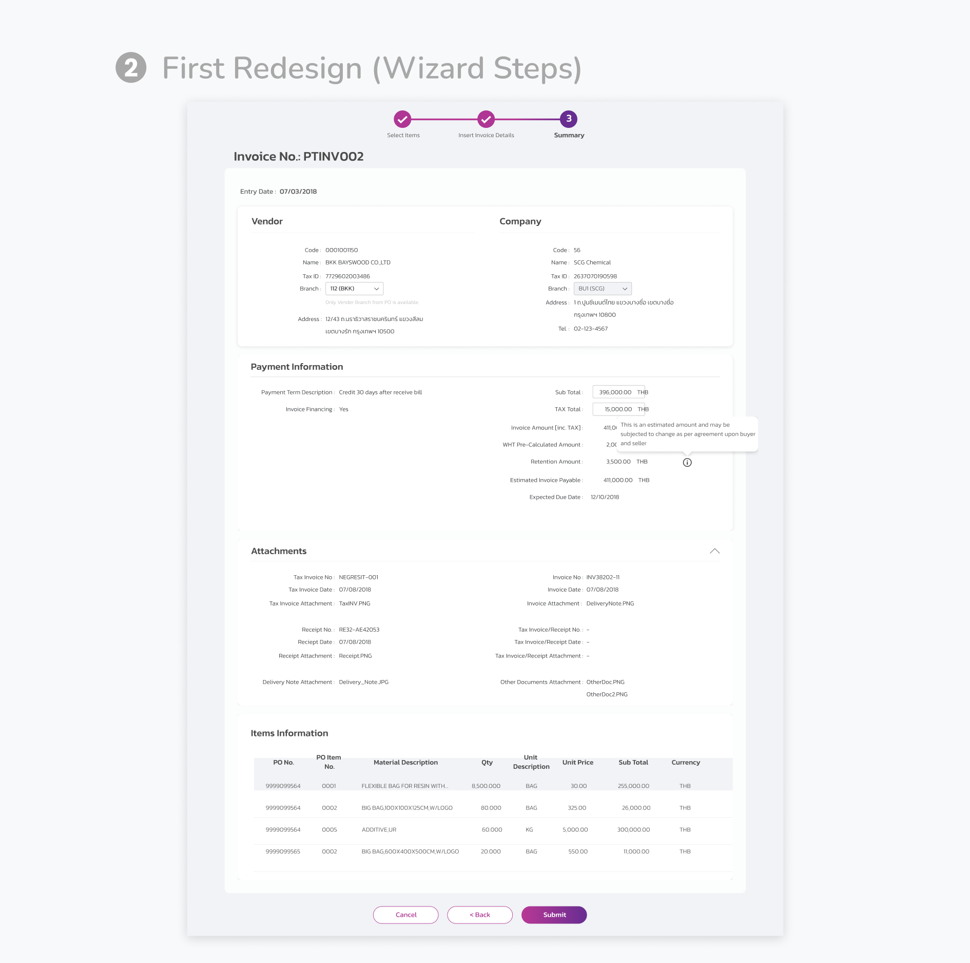
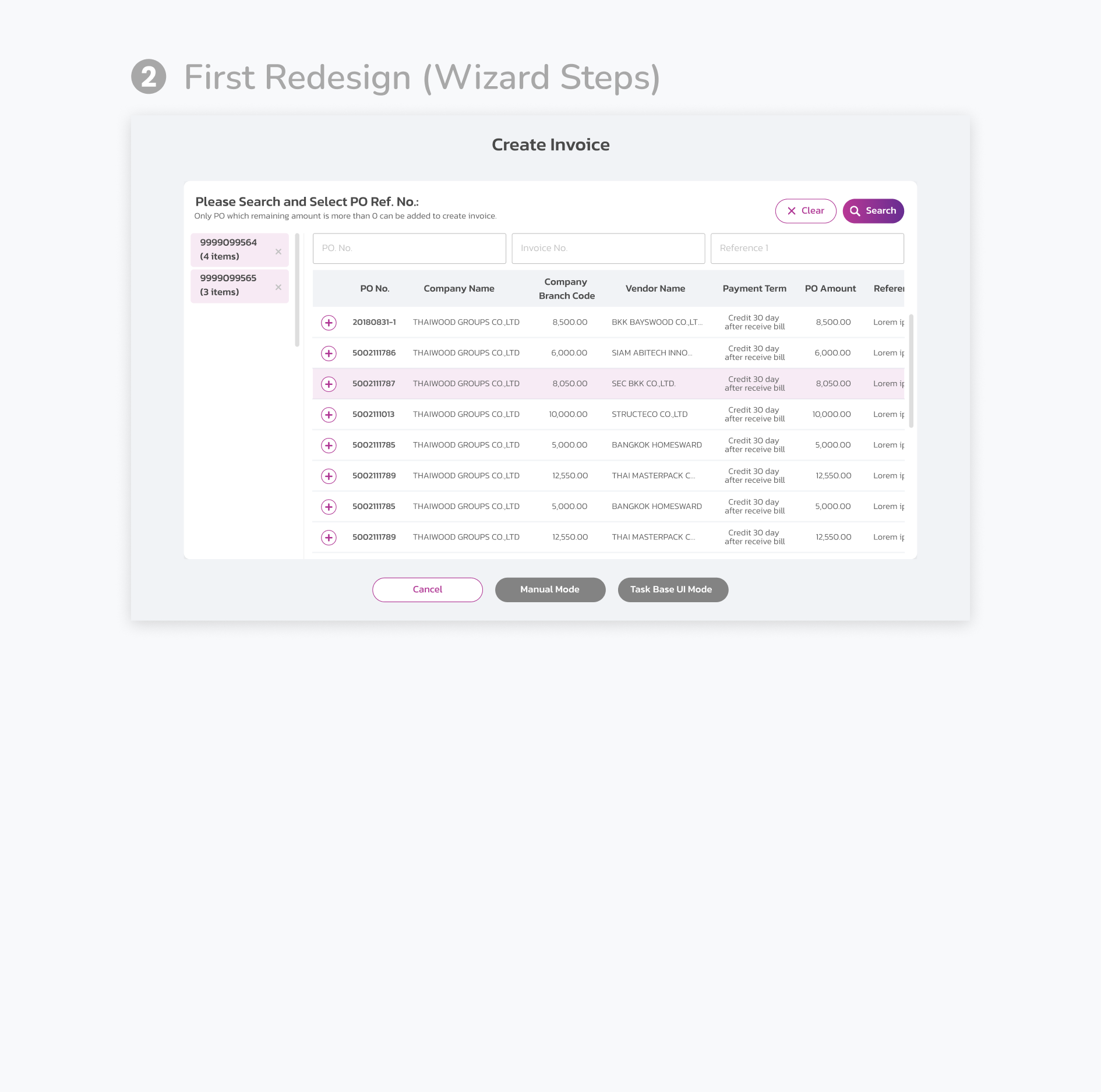
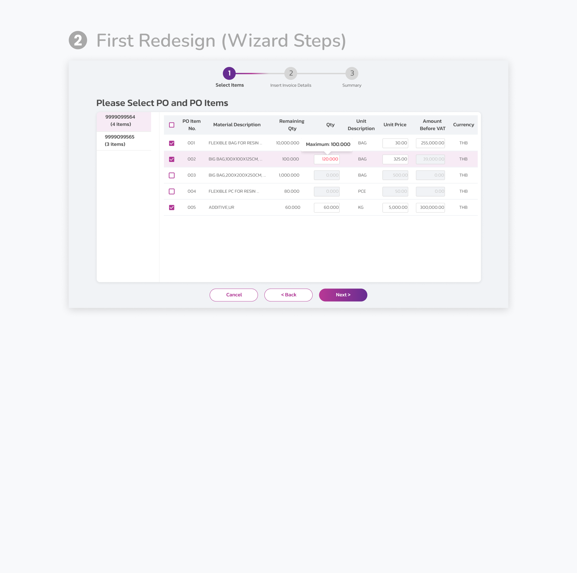
2. First Redesign (Wizard Steps)
We moved to a step-by-step wizard format, guiding users through the invoice creation process in a linear flow. This eliminated the need for excessive scrolling. However, suppliers complained that the overall process, especially the blockchain validation, took too long—over five minutes to complete.
3 Way Matching
3-Way Matching is a critical feature that integrates POs and GRs from SAP with blockchain. Every night, all submitted invoices are automatically verified against their corresponding PO and GR. If all information matches, the invoice status changes from 'Submitted' to 'Approved,' allowing suppliers to monitor the results and proceed with payment. If there is a mismatch, the status changes to 'Pending Manual Approval,' prompting a DoA Approver from the buyer's company to review the discrepancy. If the difference is acceptable, the invoice is approved to move forward. Otherwise, the supplier is requested to revise and resubmit.
PO Delivery
When a buyer places a large order, the supplier is responsible for delivering the goods to the buyer’s warehouse. However, logistical issues from either side can occasionally cause delays. The platform facilitates the process of proposing and confirming new delivery dates, helping both buyers and suppliers manage their schedules more effectively.

Reflection
Throughout the redesign, we made significant changes to the information architecture and reduced the steps needed to complete key tasks. Compared to the first version of the platform, we saw a noticeable decrease in the time it took suppliers to complete tasks. We also received fewer complaints about the design, indicating that the new interface was easier to understand and navigate.
During a training session, I had the opportunity to observe users interacting with the platform. I noticed that most participants were able to complete tasks before the trainers had even finished explaining the steps. However, I also observed a user who struggled with filling out a form. She overlooked the red message indicating that a required field was missing. According to the design, the text box border should have been red as well, but this detail was missed. This experience underscored the importance of clear communication between developers and UX designers—seemingly minor issues can have a significant impact on the user experience.
We've also integrated Google Analytics into the platform, allowing us to collect quantitative data that helps us continually improve the user experience. In addition to this, I am eager to conduct more contextual inquiries to better understand how users work in their real environments. My role is ongoing—constant iteration and testing are essential to making the product a pleasure to use and ensuring that customer experience remains a core driver of the platform's success.
LIKE MY WORK?
WANT TO DISCUSS MORE?
Drop me a message
Download resume
Contact
© 2025 designed by Nanthawan 💻
We conducted the first round of usability tests, made adjustments, and then tested again with a new group of users. Here’s what we learned:

After gathering the testing results, my team reported our findings and recommended solutions to the stakeholders. We collaborated to determine the final solutions. While not all issues could be resolved through design alone, I will present the revised screens, explain the key insights, and demonstrate how we adjusted the design to alleviate user pain points.
Task 1 & 2: Landing Page and Dashboard
The dashboard is the first screen users see after logging in. Our goal was to present actionable insights that inform users of the steps they need to take.
1. Initial Dashboard
When I first joined, the dashboard displayed only a single donut chart. Users had to manually add widgets and select different time periods to view invoice statuses. This process was cumbersome and didn’t provide enough valuable information at a glance.
2. First Redesign (Adding More Data)
In the initial redesign, we added more charts and statistics to the dashboard, with content varying depending on the user's role. However, some suppliers misunderstood the donut chart showing invoice statuses, mistaking it for a loading indicator. Most users bypassed the dashboard altogether and navigated directly to the "Create Invoice" page. Many also missed that the chart was clickable and could filter invoices by status.
3. Second Redesign (Task-Oriented Approach)
Seeing that users weren’t engaging with the dashboard data, we shifted to a task-oriented design. We replaced static statistics with a "Today’s Tasks" section and added shortcuts for quick access to important features. To modernize the look, we removed the side menu and replaced it with a hamburger menu at the top. However, testing revealed that users found the "Today’s Tasks" section confusing, and the shortcuts resembled ad banners, leading them to ignore these elements.

4. Final Redesign (Improving Usability)
In the final version, we moved the shortcuts to the top of the page and redesigned them to look more like buttons than ads. We also improved the invoice status chart by adding clear labels and the number of invoices in each status, making it obvious that the chart was interactive. This redesign proved effective—users quickly grasped the purpose of the chart, interacted with it to filter data, and used the insights to take action.
Task 3 & 4: Creating an Invoice
Creating an invoice involves selecting a PO, adding relevant items, and attaching necessary documents. We tested the process by asking users to create invoices based on sample documents.

1. Initial Create Invoice Screen
In the original design, users had to scroll down to find the "Add Item" button, which opened a modal for selecting POs and items. After selecting, they had to scroll back up to fill in invoice details, then scroll down again to attach documents. This disjointed layout was especially confusing for new users.
2. First Redesign (Wizard Steps)
We moved to a step-by-step wizard format, guiding users through the invoice creation process in a linear flow. This eliminated the need for excessive scrolling. However, suppliers complained that the overall process, especially the blockchain validation, took too long—over five minutes to complete.

3. Pre-Generated Invoice
To improve efficiency, we introduced the option to select multiple POs per invoice. For users who preferred a faster workflow, we added pre-generated invoices, which allowed them to skip manually selecting items and attaching documents, significantly speeding up the process.

4. Improving Usability
In previous designs, we hid item details in an accordion, which many suppliers overlooked, leading to errors in the invoice. To solve this, we expanded the table to make all item information visible upfront. After creating the invoice, users now receive a confirmation notification, improving clarity and satisfaction with the process.
Task 5: Document List Page
Our system handles various types of documents, and we designed document list pages with a consistent layout for all document types. While the structure is similar, the content displayed differs depending on the document. Users can easily access each type of document via the sidebar menu. Below are some of the key changes I made to enhance the design.

1. Initial Document List
Initially, users had to click a search button to reveal the search and filter options. The page displayed over 20 columns, requiring horizontal scrolling to find relevant information, which made navigation difficult.

2. First Redesign (Search and Customizable Columns)
We redesigned the page to make searching and filtering more intuitive by placing a keyword search box at the top and adding an expandable search bar for more detailed criteria. To reduce horizontal scrolling, we introduced “Column Display”, allowing users to select and save their preferred columns for future use.
Task 6: Resubmitting an Invoice
When a supplier submits an invoice, the system automatically notifies the buyer for review. If a buyer finds an error in an invoice, they can reject it and request that the supplier resubmit it with corrections. This task involved improving how suppliers handle rejected invoices.

3. Request to Resubmit Invoice
To make the rejection reason more prominent, we added a red box at the top of the page, hoping this would draw users' attention. However, testing revealed that many users assumed the box contained general information and overlooked it.

4. Improved User Attention
To address this, we modified the text color from dark grey to red and added an exclamation mark to draw attention. These small adjustments successfully grabbed users' attention, and now they immediately notice the rejection reason. Sometimes, minor design tweaks can make a significant difference in the user experience.
Other Iterations
While some features were not the primary focus during testing, I’d like to highlight additional design revisions that significantly improved the overall user experience.
3 Way Matching
3-Way Matching is a critical feature that integrates POs and GRs from SAP with blockchain. Every night, all submitted invoices are automatically verified against their corresponding PO and GR. If all information matches, the invoice status changes from 'Submitted' to 'Approved,' allowing suppliers to monitor the results and proceed with payment. If there is a mismatch, the status changes to 'Pending Manual Approval,' prompting a DoA Approver from the buyer's company to review the discrepancy. If the difference is acceptable, the invoice is approved to move forward. Otherwise, the supplier is requested to revise and resubmit.

1. Initial 3-Way Matching Details
The original design provided general information such as invoice details, but the key focus was the Matching Details section, where the DoA Approver compares data across documents. However, users found it difficult to review the information. The layout resembled a simple list of goods rather than a clear comparison between PO, GR, and invoice data. Additionally, the background colors used in the table did not effectively convey meaning, leading to user confusion.

2. Revised 3-Way Matching Details
In the redesign, I implemented an accordion layout that organizes content into collapsible sections for easier navigation. In the Matching Details section, I introduced a checklist to guide users through the comparison process. To further enhance clarity, I highlighted mismatched information with red text and added a red cross next to discrepancies. This visual cue immediately draws attention to the problem areas, significantly reducing the time required to review and approve invoices.
PO Delivery
When a buyer places a large order, the supplier is responsible for delivering the goods to the buyer’s warehouse. However, logistical issues from either side can occasionally cause delays. The platform facilitates the process of proposing and confirming new delivery dates, helping both buyers and suppliers manage their schedules more effectively.

1. Initial PO Delivery Schedule
In the original version, users could propose or confirm delivery dates through the PO details page. The process involved navigating the side menu, selecting the relevant purchase order, and then proposing or confirming the delivery date. However, this process was cumbersome and didn’t provide users with an overall view of delivery schedules.

2. Revised PO Delivery Schedule – Calendar View
To improve usability, I designed a calendar tool to give users a broader, more visual representation of delivery schedules. This allowed buyers to see when to clear their warehouse for incoming deliveries, and suppliers could estimate how long they needed to pack. Proposing a new date became as simple as adding an appointment to a calendar.
3. Revised PO Delivery Schedule – Simplified View
Due to limited resources at the time, we built a more simplified version of the calendar. The layout mirrored other document list pages, with "Propose" and "Confirm" buttons placed in the last column. Users could click on the material description for more details. This version allowed users to still manage delivery dates efficiently, even with fewer resources dedicated to the full calendar tool.
User-Centered Design
I’m proud of the platform we’ve built, which not only meets user needs but continues to evolve for greater user satisfaction. Initially, our company underestimated the importance of user research. However, after conducting our first usability tests and semi-structured interviews, we gained invaluable insights that helped us make meaningful improvements. These findings have been crucial in ensuring that users can complete their tasks with greater ease and, most importantly, without frustration.
Following multiple design experiments and iterations, I also developed a comprehensive style guide. This guide has streamlined the design process, enabling both designers and developers to apply consistent design elements quickly and efficiently across the platform.
Reflection
Throughout the redesign, we made significant changes to the information architecture and reduced the steps needed to complete key tasks. Compared to the first version of the platform, we saw a noticeable decrease in the time it took suppliers to complete tasks. We also received fewer complaints about the design, indicating that the new interface was easier to understand and navigate.
During a training session, I had the opportunity to observe users interacting with the platform. I noticed that most participants were able to complete tasks before the trainers had even finished explaining the steps. However, I also observed a user who struggled with filling out a form. She overlooked the red message indicating that a required field was missing. According to the design, the text box border should have been red as well, but this detail was missed. This experience underscored the importance of clear communication between developers and UX designers—seemingly minor issues can have a significant impact on the user experience.
We've also integrated Google Analytics into the platform, allowing us to collect quantitative data that helps us continually improve the user experience. In addition to this, I am eager to conduct more contextual inquiries to better understand how users work in their real environments. My role is ongoing—constant iteration and testing are essential to making the product a pleasure to use and ensuring that customer experience remains a core driver of the platform's success.

1. Initial Invoice Details
On the document list page, users could click an invoice number to view its details. In the original design, the rejection reason was hidden at the bottom of the page, requiring users to scroll down to find it and then back up to edit the invoice.

2. Revised Invoice Details
In the redesign, we reorganized the invoice details page for better clarity and added more information upfront. Suppliers now receive email notifications when an invoice is rejected, with the invoice status changing to "Request to resubmit." However, users still had to scroll to find the rejection reason, which caused confusion.
LIKE MY WORK?
WANT TO DISCUSS MORE?
Contact
© 2025 designed by Nanthawan 💻
LIKE MY WORK?
WANT TO DISCUSS MORE?
Contact
© 2025 designed by Nanthawan 💻
LIKE MY WORK?
WANT TO DISCUSS MORE?
Contact
© 2025 designed by Nanthawan 💻
LIKE MY WORK?
WANT TO DISCUSS MORE?
Contact
© 2025 designed by Nanthawan 💻
B2P PLATFORM
B2P PLATFORM
B2P PLATFORM

